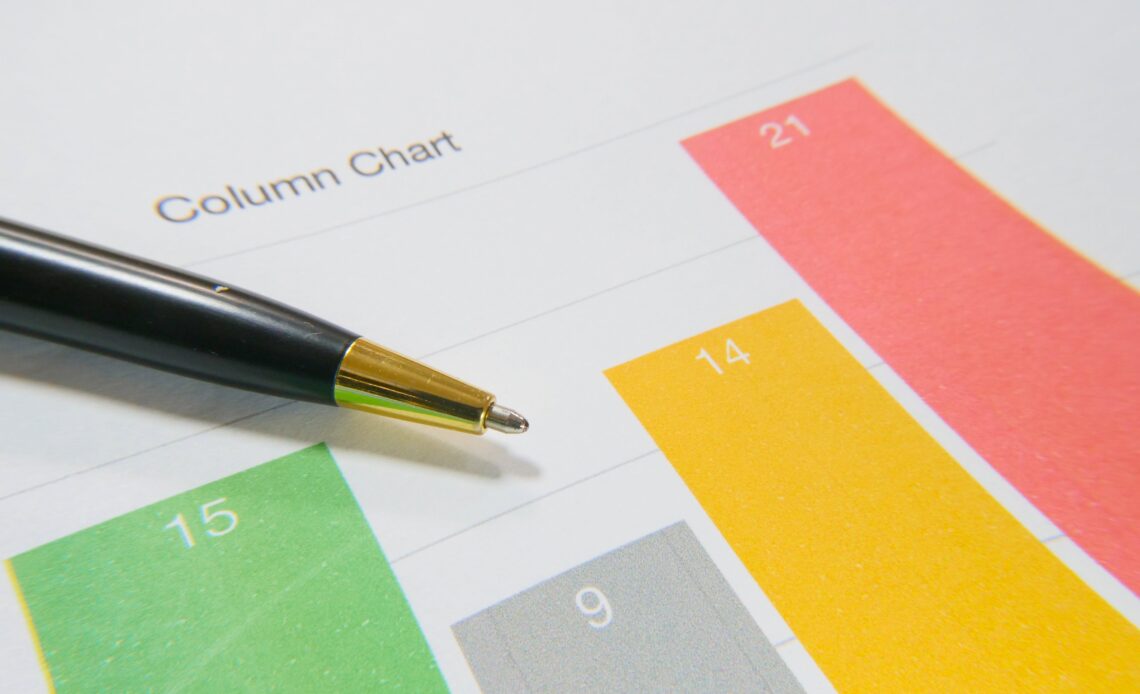
In today’s data-driven age, column charts are extensively used in illustrating and analyzing data. These handy visuals can provide useful, digestible information when properly interpreted. However, reading a column chart can be tricky for those familiarizing themselves with this form of data visualization. In this article, we aim to ease this process by providing essential tips to effectively read and make sense of column charts.
Getting Familiar With the Basics of a Column Chart

A column chart is a type of data presentation, utilizing vertical bars to display data. The height of the bars typically represents the data’s value. This type of chart is commonly used to compare data across different categories. Understanding this fundamental concept will help you get the gist of reading a column chart.
Most column charts will have two axes. The horizontal axis, also known as the x-axis, displays categories being compared, while the vertical axis, the y-axis, represents the value or frequency of the data. It’s crucial to pay attention to these axes when reading a column chart. Understanding the axes provides a clearer view of the chart’s purpose.
Column charts can also be presented in several styles. The most common ones are the clustered column chart, stacked column chart, and 100% stacked column chart. Getting familiar with these basic patterns can help in understanding the information being conveyed.
Lastly, don’t overlook the chart title. It delivers the main context of the data being presented, which can be a crucial starting point for analyzing the chart.
Effective Strategies for Reading Column Charts

An excellent strategy for reading column charts is to start from a big-picture perspective, gradually narrowing down to specific details. Start by digesting the title, axis labels, and legend to understand the context of the data presentation.
Next, observe and compare the height of the columns. Look for any patterns or significant differences that stand out. This will allow you to identify key trends and comparisons in the data.
It may be helpful to physically trace the columns with your finger or a pointer, especially when dealing with multi-series column charts. This can help you focus on individual data series and make more accurate comparisons.
Finally, take note of the source of the data. Understanding where the data comes from can add credibility to the information provided and help you avoid misinterpretations.
Common Pitfalls in Interpreting Column Charts
Investors, researchers, and students often overlook a few critical factors while reading column charts, impacting their overall understanding of the data. One of these common pitfalls is neglecting the vertical axis scale. Not noticing a non-standard scale can heavily skew the perception of the data.
Another common mistake is ignoring small differences in column height. Small differences can sometimes signify important trends or changes, especially in data over time.
Additionally, it is common to overlook the context in which the chart is presented. Without fully understanding the chart’s context, you may misinterpret the data.
Lastly, not considering potential bias in the chart’s construction can also lead to misinterpretation. Data visualizations are not always neutral and can be manipulated to support a specific argument or viewpoint.
Altogether, understanding how to read a column chart effectively is a valuable skill in today’s data-driven world. It doesn’t merely involve reading off numbers—it requires comprehension of the chart’s elements, scale, context, and potential bias. It’s a process of storytelling through data, translating numbers into knowledge and insights.


